
Western Vista Credit Union
Project:
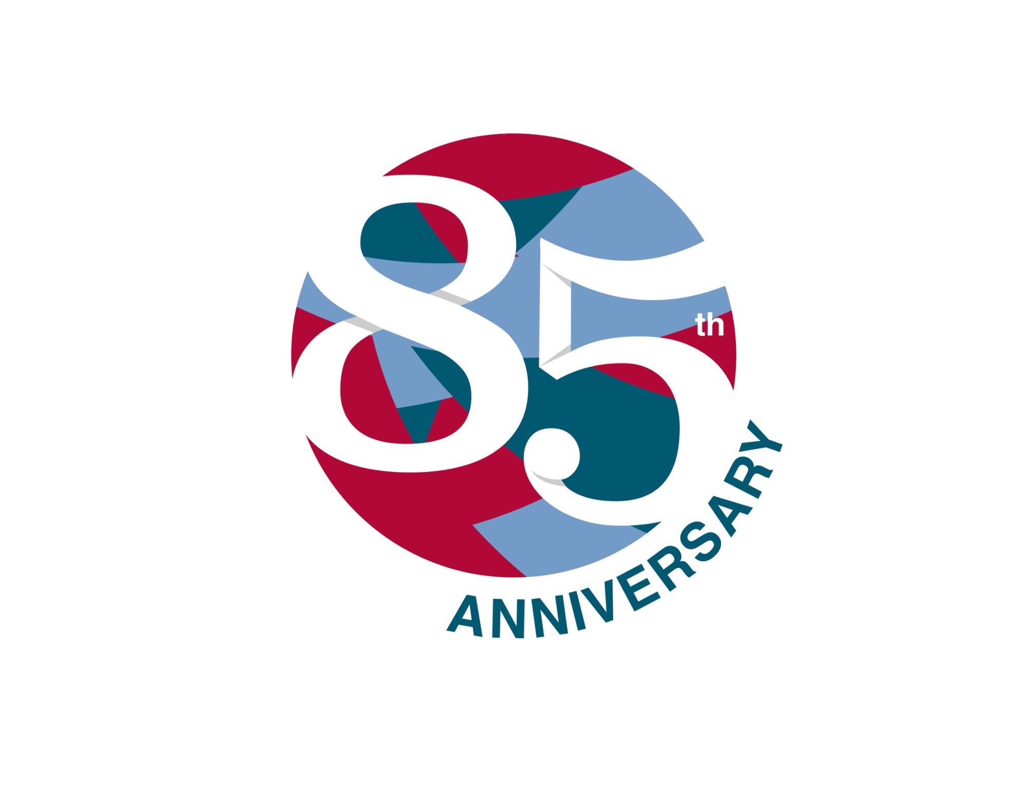
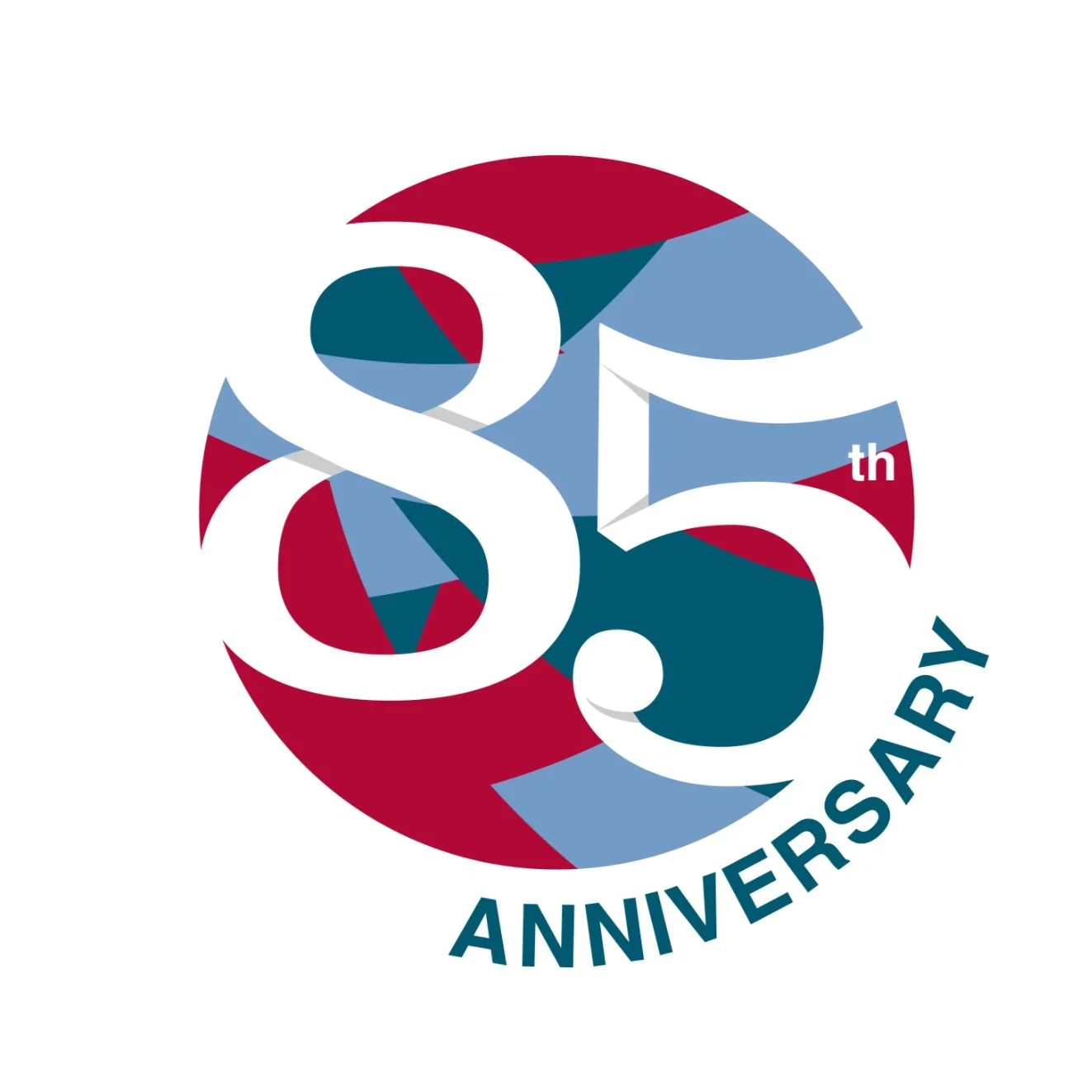
85th Anniversary Logo
To celebrate a major milestone, we were commissioned to design a commemorative 85th anniversary logo for a well-established credit union. The goal was to create a visual identity that honored the organization’s legacy while maintaining brand consistency and appealing to a multigenerational membership base.
This logo was used across print, digital, and promotional materials throughout the year-long celebration. It successfully blended tradition with a fresh, modern aesthetic, highlighting the credit union’s long-standing commitment to community, trust, and innovation. See the concepts, first round of options and then the final logo at the bottom.

Hidden Vista
Western Vista refers to their logo mark as a vista, and throughout other designs they love to have hidden vistas. The challenge was to somehow incorporate a hidden vista into this design in a subtle, yet tasteful way.

First Round of Options


Our Favorite Option
This design is full of hidden vistas, which makes it fun. It’s an out-there, abstract design that nods towards the playfulness and adventure side of the brand.
Hidden Vistas:
Top of the 5 & the shadow of the tail of the 5
Background collage
Final Logo

The Dark 85
This logo was inspired by the fluidity of the credit union’s history and plays into the infinite possibilities that come with being a credit union member at Western Vista. The Vista inside the 8 isn’t exactly hidden, but it’s strong enough to stand on its own without the Western Vista Logo. It’s simple and bold, just like their brand. A variation of this logo, mockups, and files were delivered for their needs.


